Maddisons Florist
Case Study

Long Story Short
6 min read
Challenge
Maddisons Florist, a local favourite, wants to attract more delivery orders from ‘non-local’ customers, but are competing against well-known, large floral delivery companies.
Process
Identifying a user trust score of 20% was a significant barrier to online orders for non-local customers, stemming from a lack of purchase and brand confidence, attributed to poor navigation, unappealing appearance and low brand familiarity. I redesigned the website with a user-centred approach to increase trust focusing on the User Interface, Information Architecture and strategically integrating existing Google Reviews and other trust content.
Impact
Once live, I'd measure business impact by comparing monthly delivery orders and customer return rates.
+60% Company Trust Score
By strategically incorporating trust content and improving UI and site navigation. (From 20% to 80%)
-4 steps in user journey
By reviewing the Information Architecture and primary task flow.
(From 33 steps to 29 steps)
Accessible & inclusive presence
By removing psychological exclusion and improving accessibility against WCAG AA standards.
Responsibility
End to end cycle, from research to design and delivery.
UX / UI Designer
Logistics
Client
Figma
2 Weeks
Lyssana
Solo
Notion
Tags
Validating Assumptions
Design Thinking
Responsive
Strategic Thinking
Full Case Study
Business needs

Kick-Off Meeting
Identifying that Maddisons Florist's website might be hindering their business. I visited their shop to offer my help, realising later this would be met with surprise and confusion so I should have called first, nevertheless I bought some flowers, became friends with the owners and we discussed how I could help them.
Using a Lean UX canvas to facilitate the discussion, helped me quickly define the current problems, business goals, value proposition and KPI’s.
Business Goal
Maddisons Florist want to expand their business by attracting non-local users to place delivery orders.
Client Hypothesis
Users want to order floral deliveries from large, known florists over small local shops.
Empathising with users
Challenging the client's hypothesis
Wanting to empathise with how user's think and feel about ordering flowers online and validating the business’ hypothesis. I conducted 5 user interviews with people who purchased delivery flowers in the last year.
I don’t care about which shop [I use], as long as the website presents as legitimate. If their site has poor colours and design, I don’t trust them to put together a good bouquet.
-Interviewee
Client's Problem Hypothesis
Users want to order floral deliveries from large, known florists over small local shops.
Fail
What users need and feel
Qualitative data revealed that all users would consider supporting smaller florists if the buying experience was comparable. Familiar, well designed and user-friendly websites gave them confidence in a company and their products.
Synthesising interview insights revealed:
Confidence
I like to make quick and informed decisions, so I value cost transparency.
Navigation
I want to find and complete my order quickly and easily.
Trust
The website's UI establishes my trust in the company and their products.
4/5
Shop by Occasion
"I buy for special Occasions, so the first thing I look for on the page is occasions."
3/5
New shop anxiety
"I hate the anxiety of hidden fees, gambling on product quality and if it will arrive on time"
Who are we designing for?
Synthesising the research, I developed a representative user persona, "Florence Bennett" allowing me to gain a deeper understanding of the primary user and guide my designs.

Trust
"If a shop can’t put together a decent website with good colour and design choices, then I don’t trust them to design a good bouquet of flowers for me.” - Florence

Florence
Behaviours:
-
Emotionally led, trusting her gut when buying online.
-
Likes making quick and informed decisions.
Frustrations:
-
Hidden costs anxiety.
-
Gambling on product quality and accurate delivery dates.
Needs:
-
Trust in supplier and product quality.
-
Product clarity.
Florence's core problem is trust
Florence wants to be able to find flowers easily, make informed decisions and trust the florist’s reputation and products, to deliver the bouquets on time and as expected.
Validating my hypotheses
Forming professional hypotheses and deciding impact metrics
Establishing that Florence's trust is formed by the familiarity, trust and confidence in a website’s appearance and usability. I performed a usability test (5 participants) to validate my design hypothesis of the site from my professional view, and identified key metrics which would measure my impact against Florence's key priorities; company trust score and ease of use via both an emotionally led rating score and objective error rates.
Usability key metric findings:
-
Avg Ease of Use score: 2/5
-
Avg Error Rate per user: 8
-
Avg Company Trust score: 1/5
Are the hypotheses validated by data?

Findings
5/5 users hesitant before making the first click.
“Wow it’s a lot, I don't know where to look.”
First click test showed no clear path for first choice.
"Do I go to 'Shop online' 'See our Shop' or 'Gifts'?"
Influence
Add visual hierarchy, prioritise content shown and review navigation.
Hypothesis
Competing images, dense text and unclear navigation on homepage hinders findability.
Pass
Analysing the Information Architecture
With comments of the journey length arising from the user testing, I wanted to understand the number of clicks Florence would take to purchase flowers on the happy path to validate my hypotheses and see where this could be optimised. Alongside the number of links present to Florence on the homepage, which was previously proven to confused users.
Validated Hypothesis
Competing images, dense text and unclear navigation on homepage hinders Florence's findability.
Pass

43 Links
These 'add ons' can be shown later in journey.
Helium Balloons
Foam Bears
Chocolates
Soft Toys
Cards
These could go under
the Funeral section.
These could be included on the product listing page.
Florist Choice
Bouquets
Baskets
Problem solving
Focusing Ideation
Combining insights from empathising with Florence and her core problem, with validated current design hypotheses through user testing, allowed me to start thinking of problem solving ideation streams, through How Might We’s:
How Might We:
-
Give Florence trust in the supplier, so she feels confident to make a purchase?
-
Empower Florence to confidently make quick and informed decisions?
-
Streamline the flower-buying process, saving Florence time?
Testing a new navigational concept
With a navigation review highlighting opportunities, I could start problem solving solutions. One idea was to introduce the ability to 'Find your delivery cost' in the primary navigation menu, giving Florence the requested cost transparency for trust, however 5 tree tests showed this was not well received by users and it was not carried forward.
Purchase Confidence
"I hate the anxiety of hidden fees."
- Florence

Findings
Users thought it inappropriate and blunt.
“They’re talking about money, when I haven't seen the flowers yet.”
Influence
Revert back to a traditional navigation bar to align with mental model.
Assumption
Users will find the 'Find the delivery cost' tab helpful and value the transparency.
Fail
Having the informational blueprint completed, I brought the client in on the journey so far and presented a Mid-Fidelity wireframe prototype, demonstrating how I designed for Florence's needs; trust in the company, confidence in purchase and cost transparency.
With client alignment, I set out testing the navigation, design concepts and trust impact by undertaking 5 moderated usability tests, resulting in the following influences.
Designing for trust
Purchase confidence
"I want to make quick and informed decisions." - Florence
Product page

Kicks Law
Let’s reduce product sizes from 4 to 2 options, with clear descriptions.

Findings
5/5 users were impressed by simplicity and clarity.
2/5 users showed interest in upgrading purchase.
Influence
Convert to high fidelity.
Did it work? No
Eager to see if the interactive prototype delivered the intended increase in emotional impact usability, a 5 participant moderated usability tests showed:
Assumption
Faster decision making and easier navigation, will increase Florence's product and retailer trust.
Fail
Findings:
-
Avg Ease of Use score: 3/5 +1pt
-
Avg Error Rate per user: 3 -5pt
-
Avg Company Trust score: 1/5.5 +.5pt
Strategically implementing UI trust elements
With a minimal trust score increase, I needed to design for greater emotional impact.
I thought strategically and believed that exposing Florence to frequent and short testimonial content and showcasing content from the clients 150+ Google Reviews would be more effective in building social trust, than simply redesigning the testimonials page.

Purchase Confidence
"I hate gambling on product quality."
- Florence
Original testimonial page
1. Trust on the Homepage
1. Hero quote for company trust

2. Client photos for product trust


2. Trust on the About page

3. Integrate Google Reviews, through a Google Maps API


3. Trust on the Product page

4.Product review headlines

5. Review breakdowns per product

Did the trust placements work? Yes
Eager to see if the iterated high fidelity prototype delivered the intended increase in emotional impact usability, a 5 participant moderated usability tests showed:
Findings:
-
Avg Ease of Use score: 4.5/5 +1.5pt
-
Avg Error Rate per user: 1 -2pt
-
Avg Company Trust score: 4.5/5 +3pt
Hypothesis
More visible testimonials will increase Florence’s trust.
Pass
Branding
With a website’s colour and arrangement weighing heavily in Florence’s decision to trust a florist, it was important to carefully consider the site's rebranding from both the user and business’s perspective.
Trust
"If a shop can’t put together a decent website with good colour and design choices, then I don’t trust them to design a good bouquet of flowers for me.” - Florence
Business Needs
User Needs
Consistency
Avoid costly redo's of business cards, vans and shop front to match new style.
Customer Retention
Retain brand image to keep local, loyal customers' trust.
New UI
Professional Creativity
Representative of product quality.
Accessible and Inclusive
Welcoming and easy for all to use.
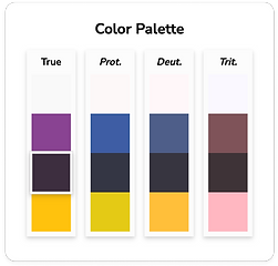
Accessible and Inclusive colour testing
Balancing company rebranding costs with user experience, I revised the site's colour scheme and changed the primary colour from hot pink to a more inclusive and luxurious purple, inspired by the petal logo; this contrast paired well with a white background for areas with heavy text.
Practising responsible design, colour pallets were tested against colour blind spectrums and contrast checks which led to the secondary colour changing from yellow to green.
Version 1
Contrast Test:
Fail
Pass
Psychologically bias for caution
Originally, the white text on yellow secondary button failed accessibility tests. Changing the text to dark purple would improve this but could negatively impact sales due to its association with caution signs.
Colour blind safe
Colour contrast safe
Valid psychological association
Iteration

Contrast Test:
Pass
Pass
Psychologically associated with florals
Changing the secondary colour to a green hue, not only passed the contract and colour blind requirements, but is psychologically associated with fresh florals.
Colour blind safe
Colour contrast safe
Valid psychological association
Visual Sign-Off
During the UI sign-off client call, the suggested colour pallet was hesitantly received, Maddisons Florist wanted to keep the original pink background. Explaining how this may hinder Florence's trust in floral arrangements, and how being inclusivity and accessible could grow their audience, we compromised on a lightly tinted version of the new primary purple, to keep a coloured background.
Agreed outcome:


Impact
Once the redesigned website launches, I anticipate measuring its business impact by comparing monthly delivery orders and customer return rates.
Retrospective
This website redesign project has been a rewarding exercise in removing my bias from the design journey, by validating my assumptions and creating data driven designs, to deliver emotional impact.
Next steps
Payment
Keep the third-party payment provider to handle sensitive card data, ensuring PCI compliance and data security.
Sneak peak basket
Make a side panel showing the basket content throughout the checkout for extra reassurance.
Learnings
Challenge the problem
If a problem hypothesis is provided, test it with users to establish validity.
Stakeholder Engagement
Although excitement can run away with us, it’s best to book time in with stakeholders before turning up, to avoid surprises and build a positive relationship.
Testimony

“The site looks so much more organised and professional, I had no idea about accessibility so thanks for pointing that out. I just liked pink!”
Owner